This past Wednesday at the assembly, I presented my project to the school and got many feedbacks. It's a great opportunity for me as I also got to know more people who are familiar autism in our community and they are very willing to look at my future art works. Here is the script of my presentation.
Inspired by my experience volunteering at an autistic institute for kids and amazed by their talent to draw at an exhibition held by that institute, I thought about art therapy for these children. When I talked to the teachers at the institute, I found a lack of learning materials designed for autistic children to develop mentally, I decided to do more research and draw an illustration book for these kids.
The research process was essential in my project. By looking at autistic artists’ drawings, I found a lot of repetition of shapes and colors in their paintings. (Stephen Wiltshire is a famous autistic artist who draws and paints detailed cityscapes. You might have noticed his huge NYC landscape drawings hanging at JFK.) You can see how structure is important in this painting. In fact, scientists believe that people who suffer from autism benefit from structures, which make things predictable, reduces stress, confusion, anxiety, and behavior problems. So I want to include similar designs in my drawings. However, as I read Temple Grandin's Thinking in Pictures, I found some interesting points. She talks about disturbances-- "a minor disturbance could cause an intense reaction." Thus, to get autistic people get used distractions and minor disturbances it is important and helpful. "She felt fortunate that she encouraged to interact with people and was seldom allowed to retreat to the world of rocking or spinning objects, which helped her to grow."
Instead of only providing visually soothing images to satisfy my readers’ need of structure or to calm them, I encourage my readers to focus and to deal with minor disturbances.
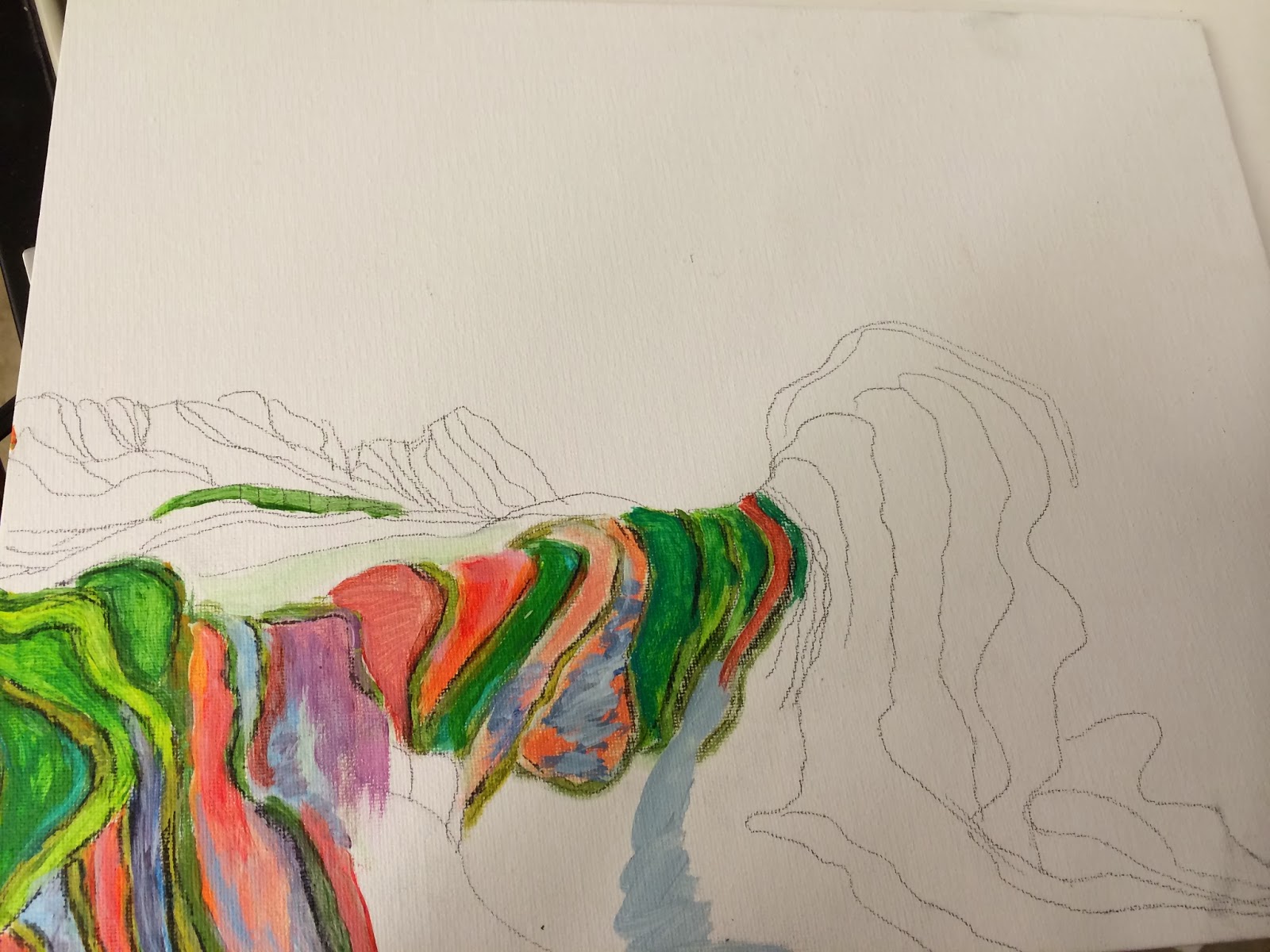
I have taken intermediate and advanced studio art classes. The portfolio that I created last year was an exploration of color white in culture and nature, something completely different from what I am doing this year, as it is more about bright colors and design. However, I did benefit from the concept of background and foreground from “the Color White” portfolio. I experimented with the abstract background and concrete object to create contrast in my Bridge and Lotus paintings.
 |
| This is not from my current project, but pieces in my "The Color White" portfolio, and they inspired me to think about the idea of foreground and background. |
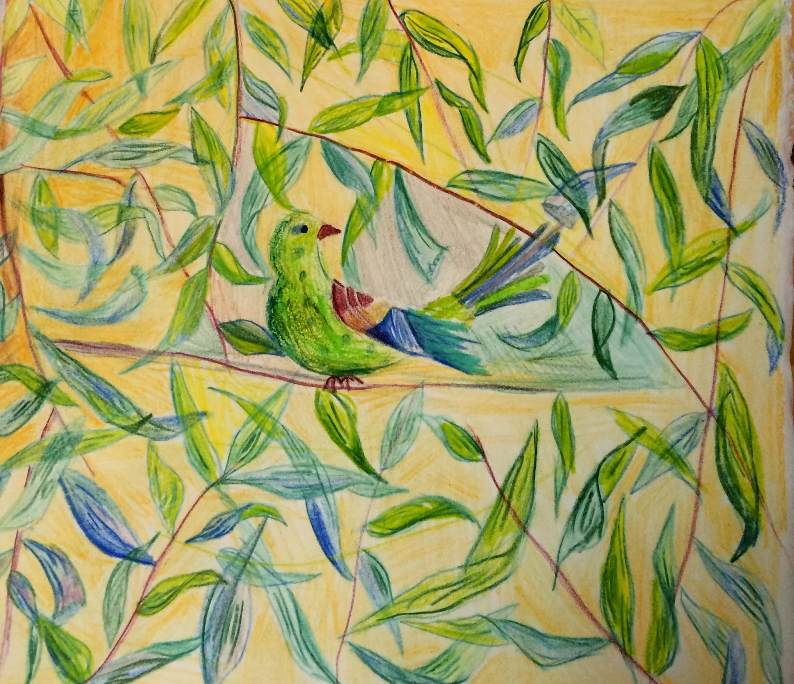
In this drawing that is later in the illustration book, the bright green leaf pattern in the background might catch the attention of the young readers, but I would like to challenge them to focus on the foreground and ask them to count the number of trees instead.
I started creating patterns, which will be the beginning of the book. I integrate numbers into the book to help autistic children grow intellectually, as in this painting of balloons. Here is another drawing with the similar idea.
In this drawing, it is the fun swirl of vibrant colors, the pattern and structure that would attract the autistic children. It would also come up later again with the request for my readers to concentrate on the white dot in the center by asking them to count the number of pink circles.
I seek for opportunities to talk to people in this field. At the Mini Maker Faire, I talked with Julie Roth, an artist and a mother of a son with Asperger Syndrom and a toy designer who made toys for autistic children. They both introduced me to the idea of tactile and when it comes to the point of making the book, I will take the material of paper into consideration.
This art project for me is a highly interdisciplinary and creative process. There are still lots of unknowns, but that to me is the essence of creation and experimentation.


.jpg)